My Motto
Always designing with the customer and business in mind.

Pivotal Website Redesign
A website transformation to match the immersive experience the Pivotal Helix offers its customers.
The Pivotal Helix; an electric, single-seat flying aircraft needed to transform their website to match the immersive experience the Helix offers its customers.
The Team
Creative Director
Senior Product Designer (me)
Design System Designer
Visual Designer
My Role
Audit the current site for content, layout, and navigation. Create zone diagrams for core pages to redesign. Design components and pages in desktop and mobile breakpoints. Create high fidelity prototypes of components and pages.
The Challenge
People who visited the website left with more questions than answers. They saw the aircraft and wanted to learn more about it, but the search for information was a daunting task. Our point of view was: offering a new, high-end product to a niche audience requires a web experience with minimal friction and maximum inspiration.

YETI Year in Preview Website
Instead of looking back on your year, look forward to a year jam-packed with epic Yeti events with Yeti, Year in Preview.
A campaign website experience to make Yeti customers aware of all the different ways to participate in YETI’s epic events.
The Team
Creative Director
Senior Visual Designer
My Role
I worked with the creative director to establish the look and feel of the campaign site. I created designs in desktop, tablet, and mobile breakpoints and prototyped them for client presentation and developer reference. I worked closely with developers to implement our designs and animations.

YETI is a category leader in outdoor everything. However, they didn’t have a simple, interactive way to make their customers aware of all the different epic Yeti events. The Year in Preview was designed to be a platform for outdoor enthusiasts to have the opportunity to begin looking forward and scheduling activities right to their calendars for the upcoming year.
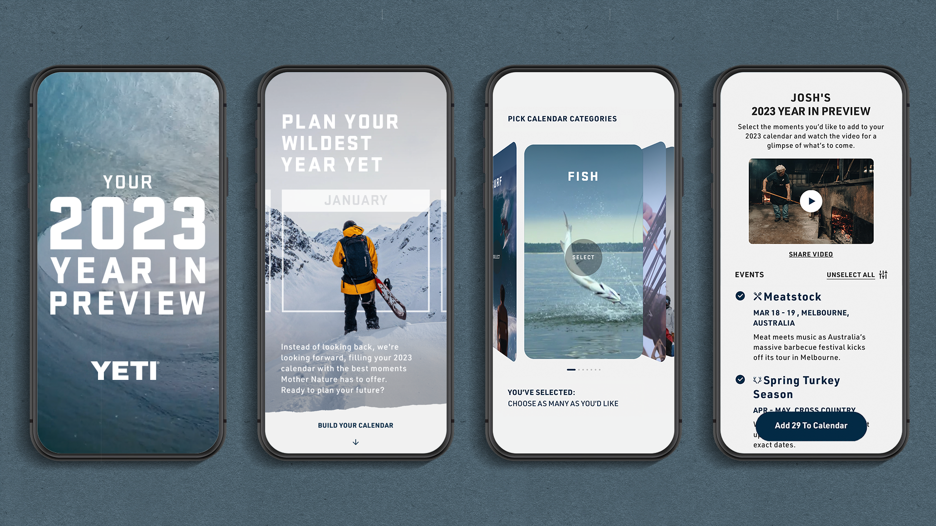
An interactive year of events in 4 clicks
YETI loyalists are eager to be outside, not in front of a computer. By choosing what they’re interested in, and music to set it to; customers have a personalized and engaging video, event recommendations, and the ability to add to calendar — all in matter of moments.
Your personalized 2023 calendar
YETI doesn’t just sell drinkware and coolers — they sell the spirit of adventure. ‘Year in Preview,’ makes good on that brand promise; surveying interests and tailoring recommendations for each customer, increasing loyalty and engagement along the way. The observed impact following the campaign was 1.3 million social views and 200+ million impressions.
Indigo Awards 2023 Agency Winner
Gold Winner in Website Design
Gold Winner in Branding for Travel
Gold Winner in Interactive Design
Silver Winner in Branding for Events
Webby winner - Websites and mobile sites, Events
Nominated for The Webby’s - Best of the Internet

JPMorgan Chase Employee App
An employee experience app to pair with the new state-of-the-art headquarters.
JPMorgan Chase unveiled the design for its new state-of-the-art global headquarters at 270 Park Avenue. They needed an employee experience to match the iconic building.
The Team
Associate Creative Director
User Experience Designer
Senior Visual Designer (me)
My Role
Set up and maintain the design system.
Design mobile app flows and prototype for client presentation and development reference.
A best-in-class design system was created as the foundation for the JPMC Employee iOS app.
Employees use their 2FA for quicker, more secure login. Once notifications and location are enabled, the employee immediately lands on home for a light-weight onboarding experience. A drawer slides up to reveal the apps core value propositions; efficient booking of rooms, timely event information, amenity information and wayfinding.
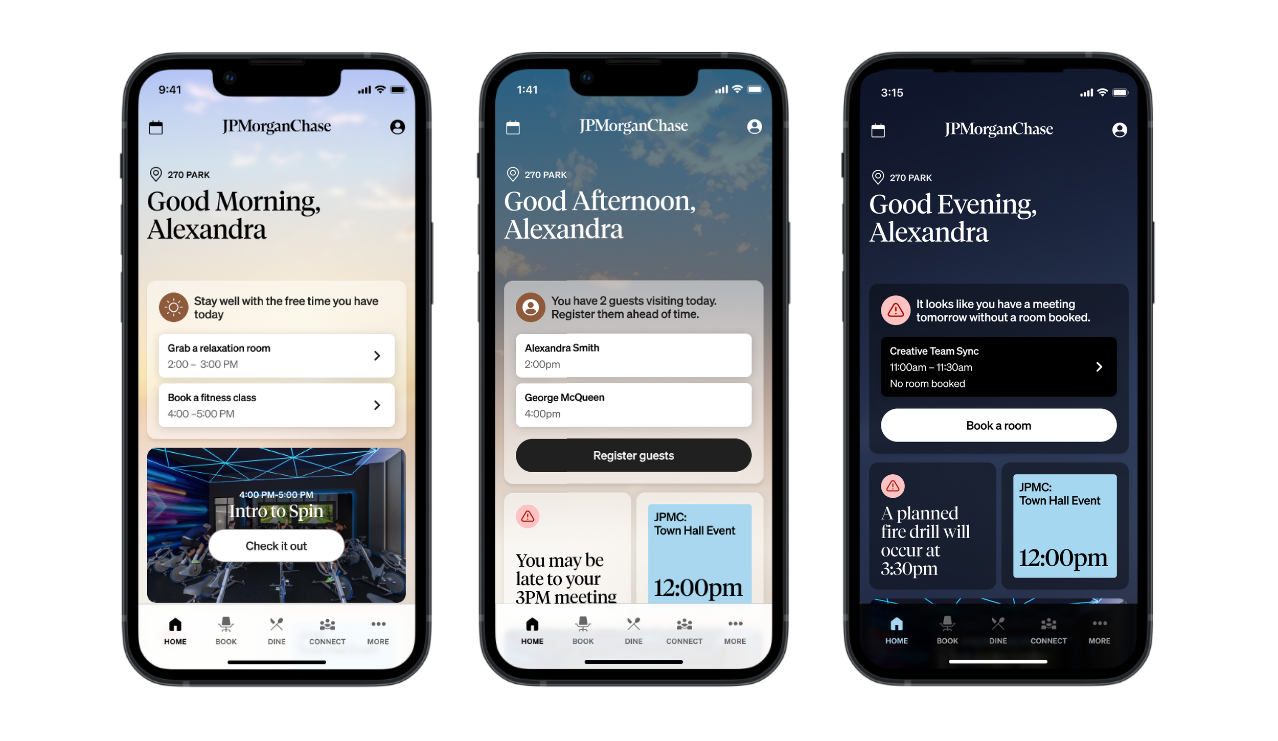
“Home” evolves as the employees day progresses. The first content section is dynamic, always housing the most relevant information for the employee in relation to their day ahead. If they have free time, the app might suggest they utilize amenities to recharge (left). When they reopen the app later in the day, the content updates to proactively prompt the employee to take action based on guest visitors (middle). Evening engagement guides the user to best plan for the next day (right).
Employees can quickly book a desk or rooms to meet their changing needs during their work day. In the booking process, desks and rooms are visible from the 3D map or list view and provide visibility into precise location, amenities and availability without having to view details. Booked rooms can integrate with existing calendar meetings the employee may have on their Outlook calendar.
Employees are prompted to pre-order their lunch based on their booked events and meetings to ensure they stay on schedule and fueled for the day. Mobile ordering as well as visibility into restaurant wait times are crucial features to help employees plan their day so they are never late.
Employee ID badge animation brings elegance to the app experience which mirrors the architecture of the new Park Ave icon.

YETI Map the Gaps Website
A campaign website experience to boost sales of the Hopper M20 cooler designed, engineered and launched in less than eight weeks.

The Team
Creative Director
Senior Product Designer (me)
Creative Director, UX Designer, Copywriter (Yeti)
My Role
I worked hand-in-hand with the Yeti creative team to take their initial idea for this campaign and turn it into the award-winning experience that is. I worked on creating user flows, a UI kit, and high-fidelity prototypes to inform the final design of the website. I then worked closely with developers to implement the designs and ensure the experience was AA compliant.
Google has mapped 98% percent of the world but naturally, wilderness enthusiasts prefer the paths less paved. For YETI, this posed an opportunity: to take the Hopper M20 — its most versatile cooler yet — and map hidden trails across the globe, making the outdoors more accessible for everyone.
We did that by designing and developing the digital experience anchoring Map The Gaps, YETI's campaign designed to take the “street” out of Google Street View — by locating and integrating some of the world’s last uncharted trails.
The Map The Gaps experience made these previously hidden gems discoverable by allowing users to easily preview and explore unmapped landscapes through video walkthroughs and immersive 360-degree views.
Map The Gaps is meant to spark thrilling new adventures for nature enthusiasts everywhere. So it was vital for us to design for a world as diverse as the terrains we explore.
We followed AA web accessibility guidelines closely, ensuring clear labels, landmarks and a structured layout for easy voiceover and keyboard use. We also added a mode to reduce motion for users with ADHD or motion sickness, keeping YETI's brand promise of truly making the wild more accessible in every sense of the word.

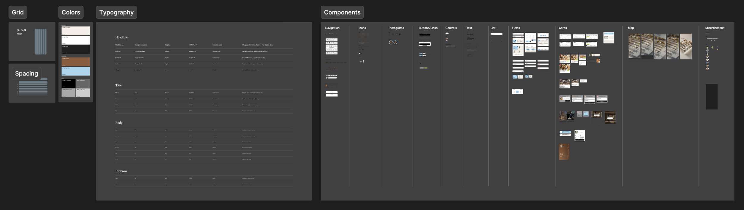
We worked with YETI to design a new modular design system using familiar iconography, bold colors and intuitive user interactions to bring together an experience that delivered surprise and delight to users.
Impact
300% Increase in Hopper sales
1B Monthly users accessed through Google API
78M Impressions from press Across Forbes, Ad Age, The Drum, Gear Junkie and more
75 Miles of newly charted trails added to Google Street View
3x Gold Winner in The Drum Awards for Marketing, Webby Award Winner for Best Use of Online Media, Merit Winner in The One Show and ADC

Under Amour App
A legacy athletic brand gets a refreshed e-commerce app that expands their audience and puts them back on the playing field.
A legacy athletic brand gets a refreshed e-commerce app that expands their audience and puts them back on the playing field.
The Team
Creative Director
Visual Designer (me)
Visual Designer
My Role
Creation and maintenance of the design system with the other visual designer. Designing mobile app flows and prototyping for client presentations.
Captivating First Impressions
Users spend an average of just 7 seconds on the app store listing page, scanning major visual assets with no interaction at all before either installing the app or leaving the page for good. Increase app downloads
Increase user growth rate
Increase signups
Onboarding with Intention
Insight
In order to personalize the customer’s journey and build stronger relationships with digitally savvy audiences, Under Armour needs to gather information from the get-go. This meant customers could have a tailored app experience their first time in.
Impact
Increase app engagement
Increase signup completion
Increase customer retention
Personalized Discovery
Insight
75% of customers are more likely to buy based on personalized recommendations. By utilizing AI in the form of a “Guided Search”, customers can discover a new way to search for products based on their needs using natural language.
Impact
Increase engagement
Increase conversion
Increase purchase frequency
Increase AOV
Modern Profile
Insight
Surfacing user preferences captured in onboarding and beyond reassures customers that your brand can anticipate their needs and builds a sense of loyalty. The app must deliver on this learned information within the experience to maintain value in the eyes of the customer.
Impact
Increase customer retention
Increase purchase frequency
Increase NPS
Seamless Checkout
Insight
The majority of customer pain points within the app revolved around checking out. Small changes like communicating savings higher up, adding in third-party checkout options, including buy now pay later, and an option to donate to a cause brought checkout up to par with best-in-class experiences.
Impact
Increase shopping cart conversion
Decrease shopping cart abandonment
Increase NPS
Holistic Ecosystem
Insight
Gen Z shoppers are always connected and will buy on any device, in any format or channel. At the same time, they are surprisingly old school. They are much more likely to shop in physical stores than millennials. We needed to innovate how the app could amplify the in-store experience.
Impact
Increase engagement
Increase in-store conversion
Increase purchase frequency
Increase NPS

State Farm - Drive Safe and Save App
State Farm’s safe driving discount program gets optimized and integrated into the State Farm mobile app.
State Farm needed to strategize how to migrate their safe driving discount program, Drive Safe and Save, into the State Farm Mobile App as well as identify missing opportunities within the Drive Safe and Save experience.
The Team
Creative Director
Visual Designer (me)
Visual Designer
Product Strategist
My Role
I worked with the Product Strategist to come up with design solutions that would meet user and business goals. The Creative Director, myself and the other visual designer defined the required components. I applied the existing State Farm design system to our designs.
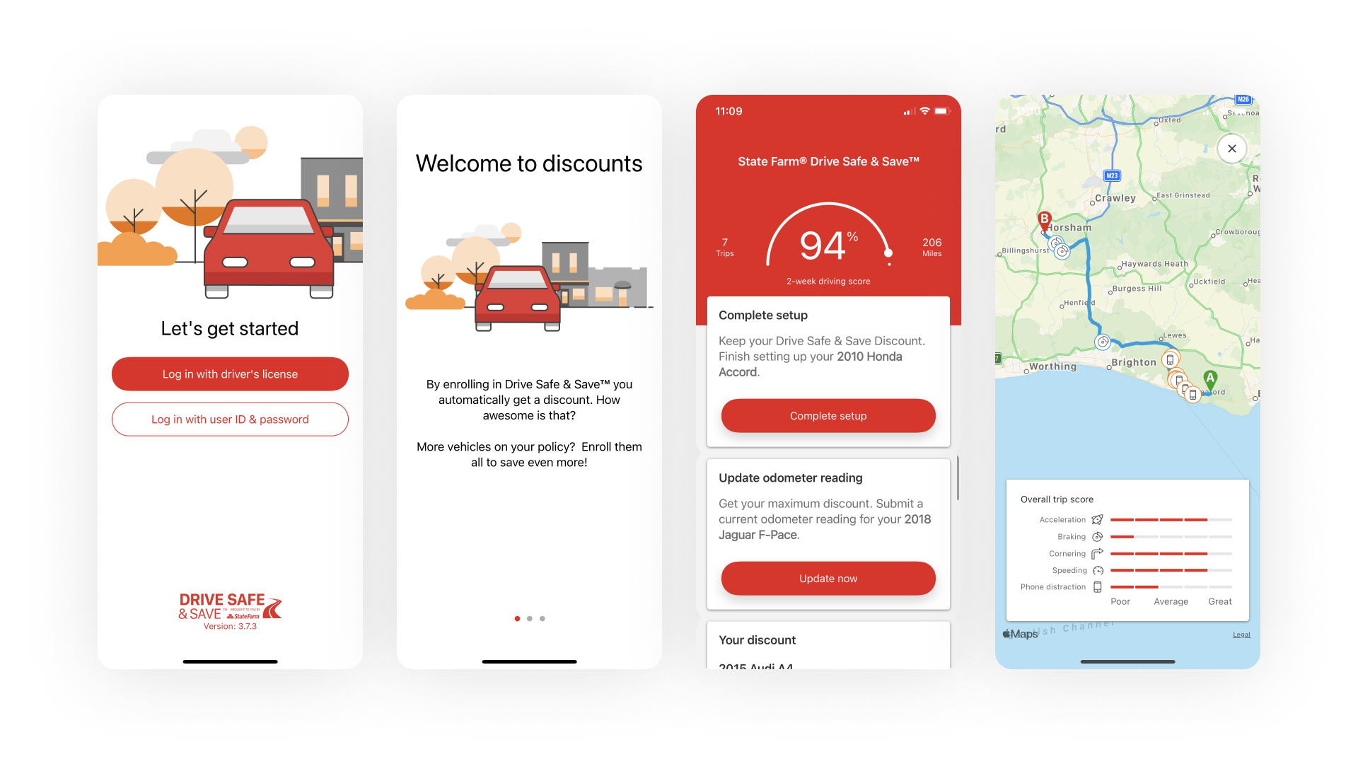
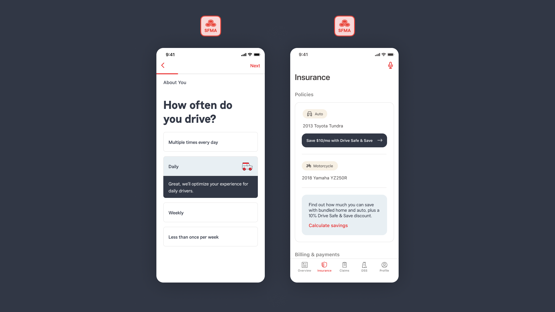
The Opportunity
The Drive Safe and Save experience was generating negative feedback. Users consistently used one word in app store reviews; “dinged”. We needed to reverse this sentiment with simple and proactive safe-driving education and support.
Customer Pain Points
Drive Safe and Save beacon setup and support
Touching my phone while in the car negatively impact safe driving score
Other drivers affecting safe driving score
Announcement
Create messaging points in both the Drive Safe and Save app and the State Farm app to inform users of the upcoming app sunset.
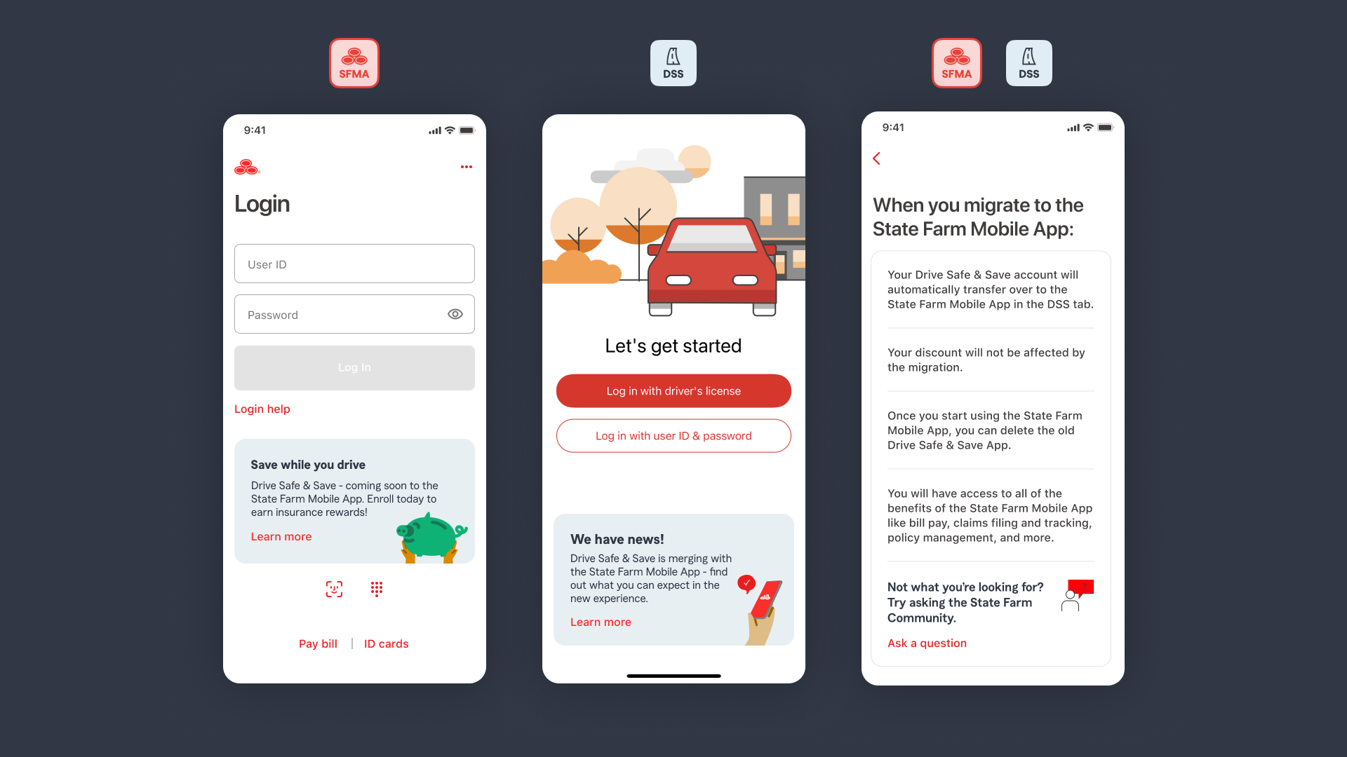
Migration
With Drive Safe and Save integrated in the State Farm app, we focused on complete transparency of the users driving score and proactively educating users on how their score is calculated so they could feel empowered in their own safe driving.
Integration
Additionally, we needed to focus on the integration strategy in the wider State Farm mobile app. The goal was to create awareness across different touch points that were contextual and supported users.
Existing Drive Safe and Save (DSS) users needed an easy way into the new, integrated DSS experience. We wanted to make that transition as simple as possible to reduce confusion around the sunsetting effort and encourage adoption of the State Farm mobile app.
Predicted Impact
Experience rating increase for Drive Safe and Save
Potential increase in mobile setup completion rate
Increase customer lifetime value from the potential addition on new auto quotes via upselling or cross-selling
Efficiency across State Farms’s customer call center (via self-service and education)